Project deliverables
- Consolidate and unify UI of four disparate products
- Reduce unique components and user flows where possible
- Create framework of reusable UI components
- Catalog UI standards and common UX practices
- Increase usability of products with simple markup changes
Overview
Triton products were developer-designed and utilitarian as I started to emerge in the company. Design culture didn't exist, user experience wasn't in the vocabulary, and every product had a separate developer using boxed components to cobble together the interfaces and functionality. As we entered into an era where users were expecting better designed, easier to use products, we were at a crossroads: rest on our laurels until something more modern came along and took our business, or commit to producing a stronger, better design and more connected set of products.
And so begun one of the main initiatives of my time with the Triton Digital team was transforming our old, dated products into new ones with modern, fresh interfaces and experiences. With a team of talented designers and developers, we embarked on what turned out to be a multi-year project by the time it was done, yet one with lasting impact on the products and culture at the company in respect to design.
Challenge
The main challenge was that we had multiple products on different technologies and code-bases - ASP Classic, .NET, Flash/Flex, PHP...you name it, we had it. On top of that, nearly all of the products had different UI components and look/feels because of using whatever off-the-shelf libraries and frameworks. There was no semblance of unity, no cross pollination between products, nothing that the users could expect to anchor to from product to product. Different colors, different typography, different calls to action, etc. We had quite a task set before us.
Approach
As the product strategy started to come together, we decided that we would attack the need by breaking this into manageable milestones:
- Create and establish a common UI framework and style guide
- Write and manage a repository of reusable HTML, CSS and javascript components
- Overhaul our largest product to provide the vast majority of coverage for converting the other products
Once we completed one large, flagship product, we would be positioned to more rapidly approach the redesign of the rest of the products, as well as having a good bedrock for new products.
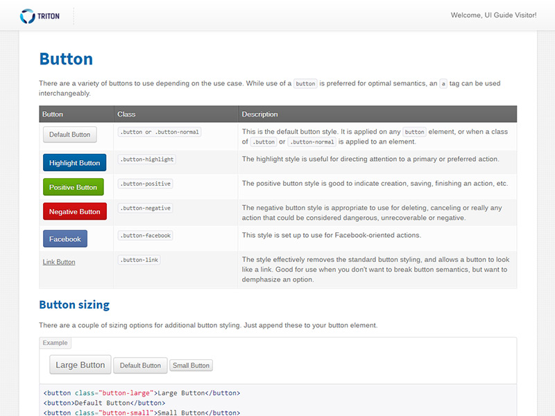
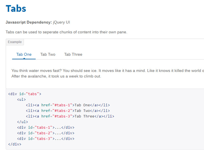
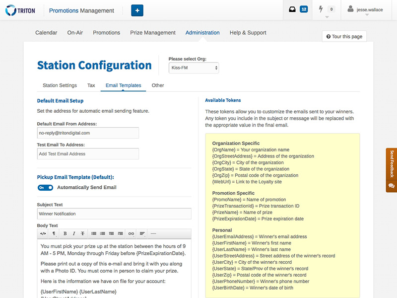
Style guide and UI framework
First, we started with defining a style guide. We established the base aesthetic, typography, colors, grid system and more. We documented these and made them gospel.
Secondly, we defined a base system of markup that would be used going forward. We created and documented everything from base shell containers up through details like alert messages. We also unified and documented the use of javascript components. All of the examples had code snippets for easy developer handoff.
Lastly, we also documented common UX practices that were shared between products, more for our benefit to recall than for design > dev usage.
View UI Guide
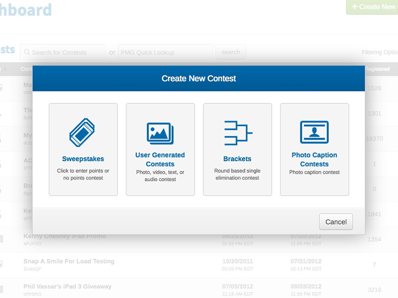
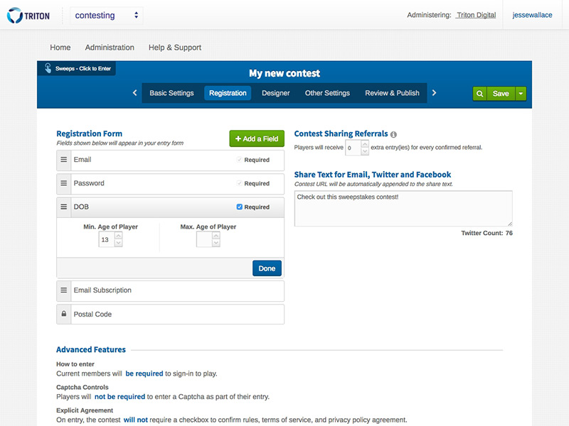
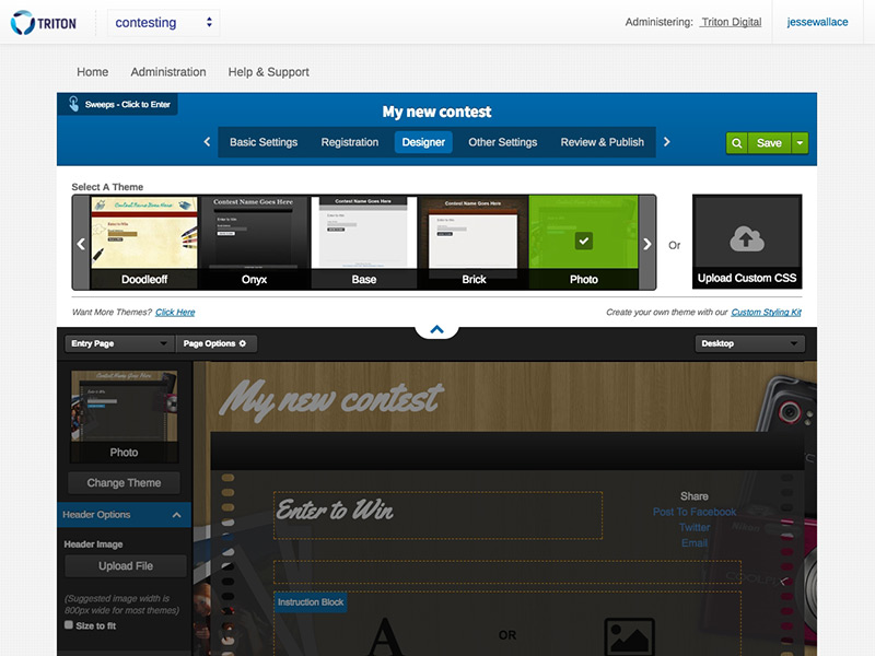
Contesting Redesign
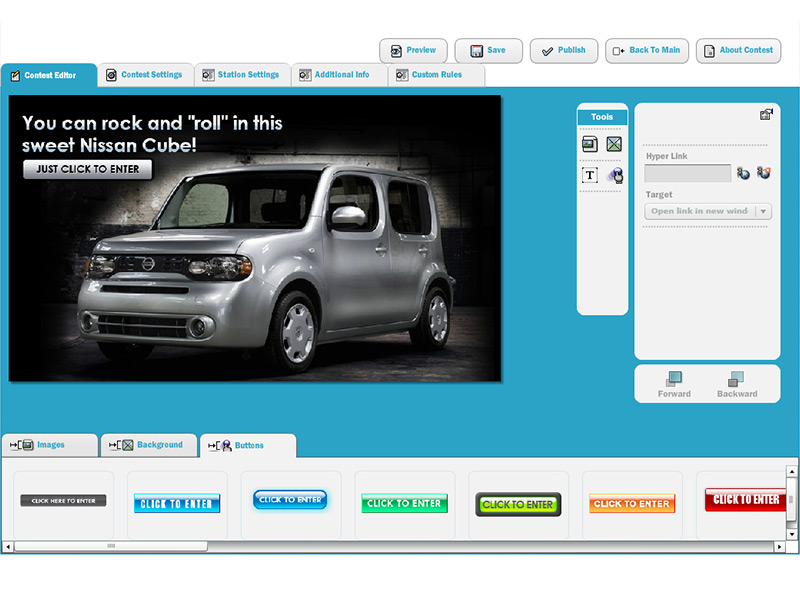
We started our platform redesign by focusing in on our flagship product, our Contest Engine. This was by far our most complex product, but we knew it would give us the best basis as we redesigned other portions of the software. The previous software was built on Flex, had a completely different aesthetic than the other products, and was very quirky to use.
We spent a hefty amount of time documenting and detailing the different UI components, and making sure we could set ourselves up for reuse wherever possible. The image with the Nissan Cube above was our old contesting engine (click to refer). You can see the redesign efforts below.
Tackling Other Products
After the successful conversion and redesign of the contesting engine, we methodically approached each product and started the redesign process with it. We went through the same iterative design cycle of making sure we were paring down to required functionality, using common components and only developing new designs when necessary.
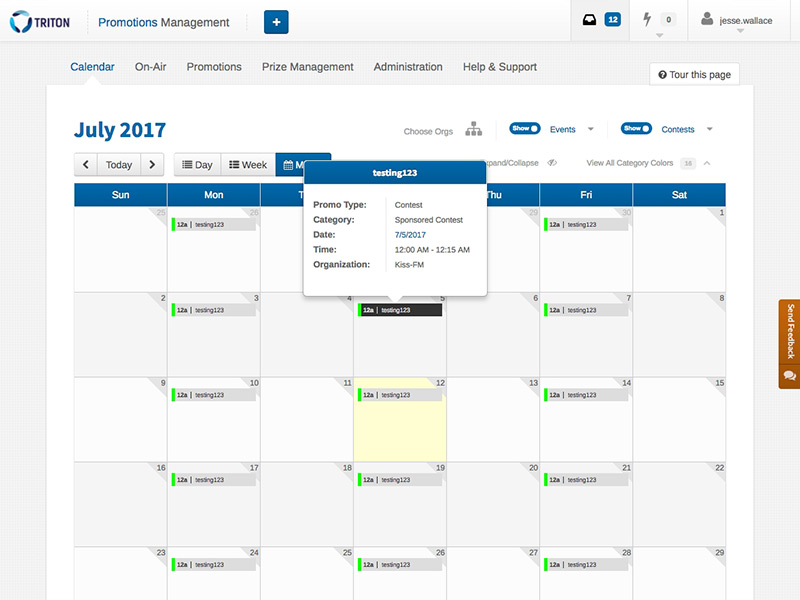
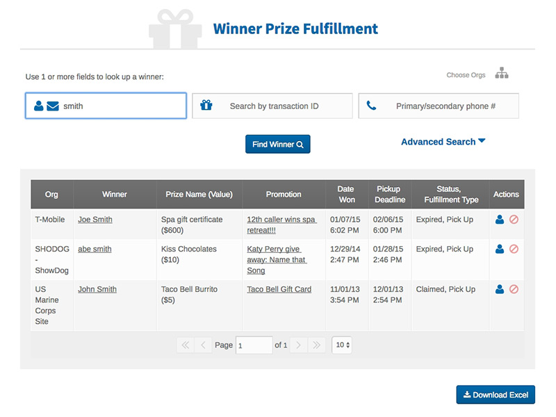
Promotions Management
Promotions Management was one of the first new products we had built since we created our style guide and frameworks. We had since transformed a few different products, and with Promo, we took those learnings and utilized them as well as creating some fresh interfaces that would benefit the target users. With this product, we had to create more baroque UI pieces than we did with any of our other redesign efforts, but the entire time we kept the framework close at hand, and introduced some of the components we made for Promo as reusable pieces in our other products.
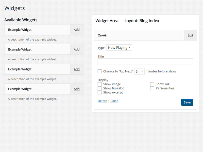
AMP CMS
When Triton decided to rearchitect it's CMS platform and base it off of Wordpress, we also decided we'd like to skin the Wordpress admin to make it look and feel like you were still in the Triton Digital ecosystem. We took a meticulous comb through the CSS and replicated the vast majority of our brand on the Wordpress platform. We also designed each custom plugin to use our user experience and usability standards, which resulted in a disconnected product having a connected feel.
Key Takeways
It was a challenging, frustrating, fulfilling and long process with lots of learnings along the way.
I learned how incredibly important a well-documented UI guide is, how much it streamlines the process and clears communication between design and dev.
I learned how much ground you can cover when you can reliably skip the Photoshop phase and hop right into code prototypes
I learned how difficult, but still yet possible it is to unify style over different code bases. Thank the lord for SASS.
I learned how to manage deviation requests, both when to allow and when to deny. When to allow wasn't very often :)
I learned this and so much more, but hopefully proof is in the detail gone into here - it was definitely an achievement and major work completed at Triton Digital.